Layout with Flexbox
What is a Flexbox?
It's a more efficient way to lay out, align and distribute space among items in a container, even if their size is unknown. The purpose is to make website responsive.
A Complete Guide to Flexbox is a great reference to CSS Flexbox. You can check it out [here]
The Magic of Display: Flex
By setting display: flex, we make the selector a flex container. All elements inside the selector are displayed inline instead of separate lines. Click [here] for a demo. This is the first step to use Flexbox.
.container {
  display: flex;
}
Terminology
Flex Container Properties
- flex-direction
- justify-content
- flex-wrap
- align-items
- align-content
Property: flex-direction
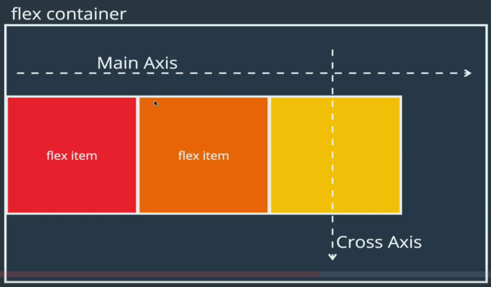
flex-direction specifies how items are placed in the flex container, defining the main axis and its direction.
/* Default */
flex-direction: row;
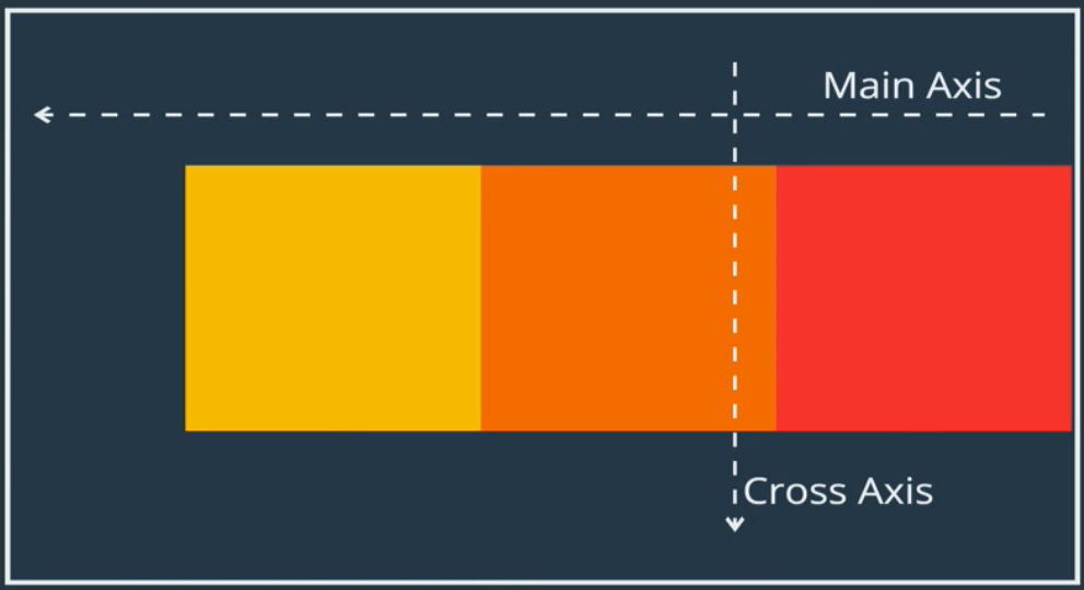
flex-direction: row-reverse;
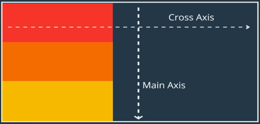
flex-direction: column;
This is like what we start with without display: flex
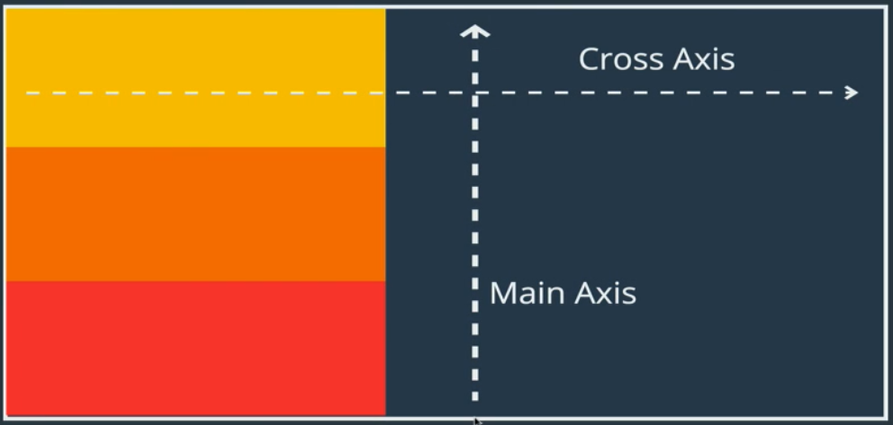
flex-direction: column-reverse;
Property: flex-wrap
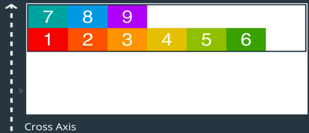
flex-wrap specifies whether items are forced into a single line OR can be wrapped into multiple lines. The default is no wrap.
.container {
  flex-wrap: wrap;
}
.container {
  flex-wrap: warp-reverse;
}
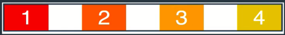
Property: justify-content
justify-content defines how spaces is distributed between items in flex container along the main axis.
.container {
  justify-content: flex-end;
}

.container {
  justify-content: center;
}

.container {
  justify-content: space-between;
}
.container {
  justify-content: space-around;
}

Exercise: Build a Flexbox Sidebar
Turn a left sidebar with 2 <div>: top and bottom into a flex container. Click [here] for starter code. Click [here] for completed code.
.sidebar {
  display: flex;
  flex-direction: column;
  justify-content: space-between;

  /* Responsive to 2 columns */
  flex-wrap: wrap;
}

.item {
  /* Add spacing between items */
  padding: 10px;
}
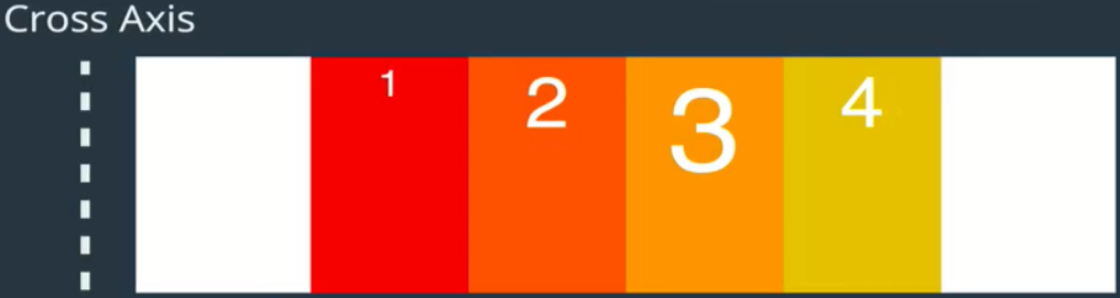
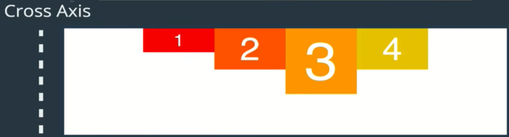
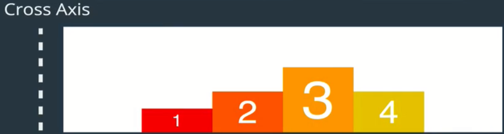
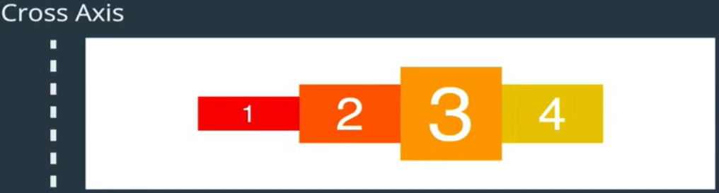
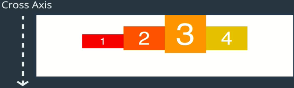
Property: align-items
align-items defines how space is distributed between items in a flex container along the cross axis.
.container {
  /* Default */
  align-items: stretch;
}
.container {
  align-items: flex-start;
}
.container {
  align-items: flex-end;
}
.container {
  align-items: flex-center;
}
.container {
  /* Align to base of all texts */
  align-items: flex-baseline;
}
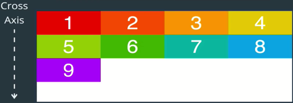
Property: align-Content
align-content defines how space is distributed between rows in flex container along the cross axis.
.container {
  /* Default */
  align-content: stretch;
}
.container {
  align-content: flex-start;
}
.container {
  align-content: flex-end;
}
.container {
  align-content: space-between;
}
.container {
  align-content: space-around;
}
.container {
  align-content: center;
}
Exercise: Building a Responsive Navbar @media
Define a break point using CSS at-rule @media. The @media CSS at-rule can be used to apply styles based on the result of one or more media queries, which test a device's type, specific characteristics, and environment. Click [here] for starter code. Click [here] for completed code.
nav {
  /* ALWAYS start with this line */
  display:flex;

  /* Explicit: set to default*/
  flex-direction: row;

  /* Shift to the right */
  justify-content: flex-end;
}
/* Define a "break point" via CSS at-rule */
@media screen and (max-width: 920px) {
  nav {
    justify-content: center;
  }

  /* Keep icon & <a> on the same line */
  a {
    font-size: 26px;
  }
}
/* Change from row to column display */
@media screen and (max-width: 600px) {
  nav {
    flex-direction: column;
    align-items: center;
    background: #34495e;
  }

  a {
    color: #FFFFFF;
  }
}
/* Styling */
a {
  /* Get rid of default */
  text-decoration: none;

  /* Define your style */
  font-size: 40px;
  color: #95a5a6;
  font-family: raleway;
  border-bottom: 1px solid #52c9aa;

  /* Add spacing */
  margin: 20px;

  / * Add Transition Effect*/
  transition: color 0.5s ease-out;
}
/* Hover effect */
a:hover {
  color: #3498db;
  border-bottom-color: #3498db;
}
/* Add space between icon */
i {
  margin-right: 10px;
}
Flex Item Properties
- align-self
- order
- flex
- flex-grow
- flex-shrink
- flex-basis
Property: align-self
align-self allows you to override align-items on individual flex items along the cross axis.
.container {
  align-items: flex-start;
}

.box-2 {
  /* Override. Same option as align-items */
  align-self: flex-end;
}
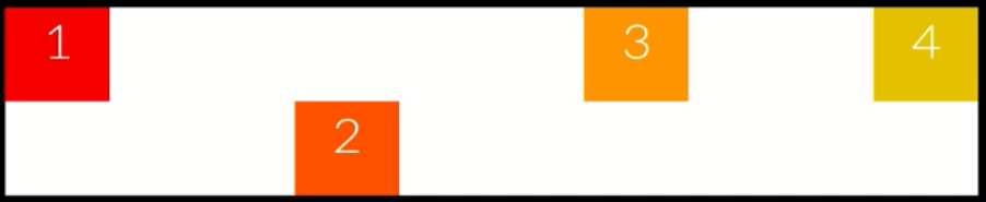
Property: order
order specifies the order used to lay out items in their flex container. All items by default have an order of 0.
.box-1 {
  /* Box-1 goes to the end */
  order: 2;
}
.box-3 {
  /* Box-3 goes to the beginning */
  order: -1;
}
/* To make Box-1 second in line*/
.box-1 {order: 1;}
.box-3, .box-4 {order: 2};
Property: flex
The property flex defines how a flex item will grow or shrink to fit the available space in a container.
The property flex is actually a shorthand property for 3 other properties: flex-grow, flex-shrink, flex-basis
.box { flex: 1 1 200px;}
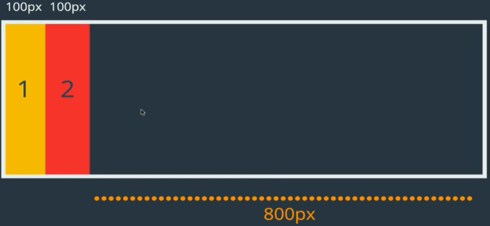
Property: flex-basis
The property flex-basis is like "width" when you're working with flex-direction: row. If you're working with flex-direction: column, flex-basis behaves like "height".
The property flex-basis specifies the ideal size of a flex item BEFORE it's placed into a flex container.
To know more about flex-basis, read the article "The Difference Between Width and Flex Basis" [link]
Viewport Height (vh)
In case you wondering what is vh, it's called Viewport Height, and it sets the size based on your screen. So if you set height: 100vh, it will first check what is user screen resolution, and if is for example 1920x1080, it will take 1080px as height. There is same thing for width, but it's not vh, it's vw, example: width: 100vw;
.container {
    display: flex;
    /* flex-direction: row; */
    flex-direction: column;
    height: 80vh;
}

.box {
    flex-basis: 150px;
}

.box-2 {
    /* Set box size*/
    flex-basis: 100px;
}
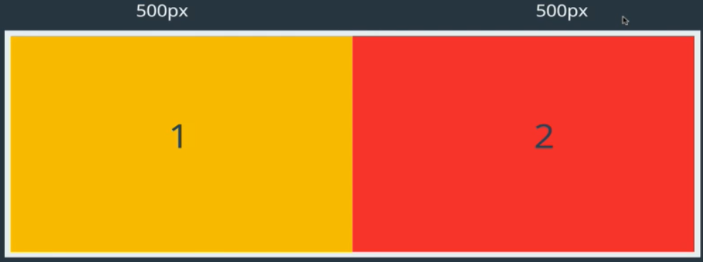
Property: flex-grow
The property flex-grow dictates how the unused space should be spread among flex items. It's all about ratios. The default is flex-grow: 0 i.e. No flex items get the unused space.
box-1, box-2 { width: 100 px;}
box-1 box-2 {
    width: 100px;
    flex-grow: 1;
}
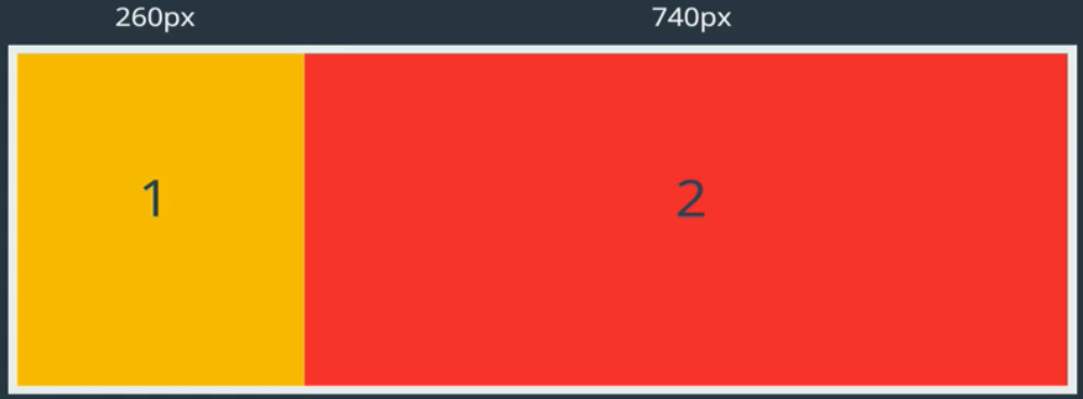 Not 4 times as large!
box-1, box-2 {width: 100px;}

box-1 {
    flex-grow: 1;
}

box-2 {
    flex-grow: 4;
}
.box {
    flex-grow: 1; /* same as 9 */
}

.box-2{
    flex-grow: 2; /* same as 18 */
}
Property: flex-shrink
flex-shrink dictates how items should shrink when there isn't enough space in container. The default of flex-shrink is 1 flex-shrink: 1. If you set flex-shrink: 0;, the item will not shrink.
.box {
  flex-basis: 500px;
  flex-shrink: 1;
}

.box-3 {flex-shrink: 4}
Exercise: Building a Polygon.com Widget
A container with 3 boxes. Using flex-basis with flex-wrap. The wrap effect won't take place until the window shrink to less than the size specified in flex-basis. In the example below, the row of boxes starts to wrap when the window size is less than 200px. Click [here] for starter code. Click [here] for completed code.
.container {
  display: flex;
  flex-wrap: wrap;
}

.box {
  flex: 1 1 200px;
  /* flex-grow: 1;
  flex-shrink: 1;
  flex-basis: 200px; */
}
Exercise: Holy Grail Layout
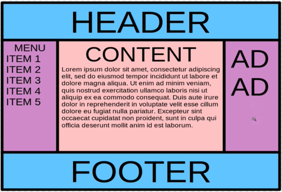
Requirements:
To read the wiki page about Holy Grail (Web Design), click [here]. Click [here] for starter code. Click [here] for completed code.
HTML
<header>
  <a href="">Nav Left</a>
  <a href="">Nav Right</a>
</header>
<main>
  <article>MAIN CONTENT</article>
  <nav>SIDE NAV</nav>
  <aside>ASIDE</aside>
</main>
<footer>FOOTER</footer>
CSS
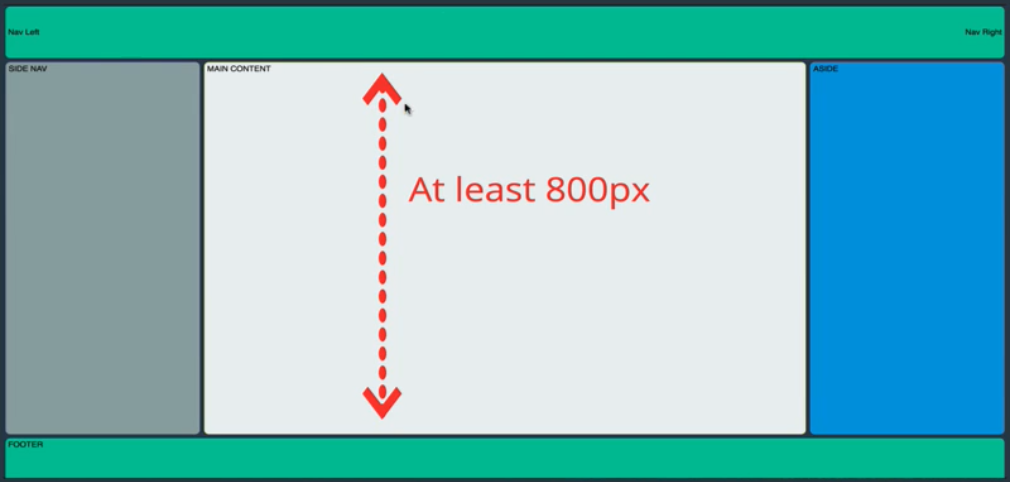
- There are 3 area to work with. We identify the body <main> to use flexbox with
flex-basiscan be expressed in percentages
header {
display: flex;
justify-content: space-between;
align-items: center;
}
header, footer {
/* height */
flex-basis: 100px;
}
body {
display: flex;
flex-direction: column;
min-height: 100vh;
}
main {
display: flex;
/* height */
flex-basis: 800px;
}
article {
flex: 4 0 60%
/* flex-basis: 60%;
flex-grow: 4; */
}
nav {
flex: 1 1 20%;
order: -1; /* send to beginning */
}
aside {
flex: 1 1 20%;
}
/* Child combinator: > */
/* Select all elements under main */
main>*, header, footer {
margin: 4px;
padding: 5px;
border-radius: 7px;
}
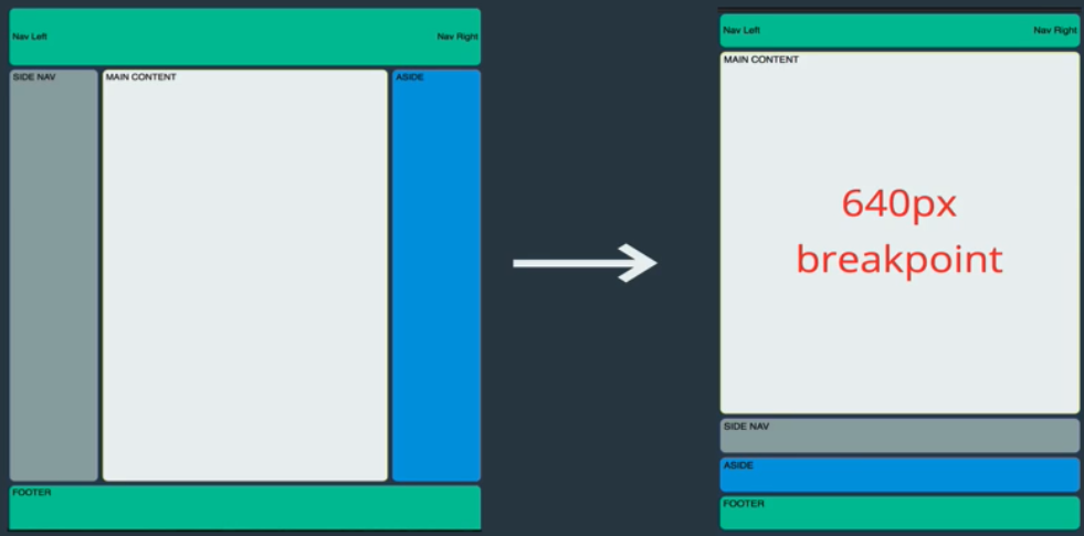
/* Break point handling */
@media all and (max-width: 640px){
/* Whatever put in here will apply when width is < 640px */
main {
flex-direction: column;
flex-grow: 1;
}
nav {
order: 0;
}
}
Flexbox Browser Support
From caniuse.com [link], you can see flexbox is fully supported on all modern browsers without any prefixes.
However, if you need flexbox to work on an old browser, you can use Auto Prefixer [link] to automatically insert vendor prefixes in your code. Also, the following 2 articles may also help: